Showing posts with label logo. Show all posts

Friday, 9 April 2010

Logo development and final design

For the final stage in the creation of a logo, I have created 12 developed designs following the ideas I produced in previous posts. I used Adobe Photoshop CS3, a graphics tablet and again the stock shapes and stock font explored in the ideas posts. The logos have been annotated which shows the thought processes and positive and negative aspects of each.

The final design was chosen as I believe it has a good balance between sharp and soft shapes and bright, attractive colours. The logo is unique and very simple which will grab the attention of people and women in particular.

Logo Ideas

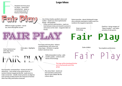
After initially drawing some of my font ideas by hand I decided that it would be faster and simpler to use stock fonts available in Adobe Photoshop CS3. By using Adpbe Photoshop I was able to practise with the program I will use to create my media product and also experiment with enhancing the logo with tools like "drop shadow" and "gradient overlays". In the first part of the ideas generation process I have been able to find a font and colour which will be used in my logo (see annotations for explanations).
I next took my initial idea of adding a pattern behind the text to make the text stand out and appeal more to women and created a collage of shapes, floral shapes (feminine), which will be added to the text in the development stage.
This collage is a mixture of stock floral shapes and ones I have drawn myself using a graphics tablet. I particularly experimented with gradient overlays in attempt to get a metallic texture, I think that the pattern in the background of the text should be brightly coloured in contrast to the black text on the logo, making it stand out more. I particularly like the large red pattern in terms of shape as it is very sharp, almost like razors, and yet a feminine form. This conforms with the font of the logo. The colour and metallic sheen however will have to be developed further and I will look at whether a block bold colour will compliment the text and theme more than a pastel, harmonised scheme. As well as gradient overlays, I also experimented with drop shadows, inner shadows, outer glows and inner glows, the results of which can be particularly seen towards the left side of the page. These tools accent the shapes and may be implemented during the development stage.

Wednesday, 7 April 2010

Title Ideas and logo designs

As a starting point in the creation of my magazine I have generated some ideas for titles for it (see below). These may not make alot of sense but the spider diagram somewhat shows my process of thinking, I began by jotting down words which are associated with women and femininity followed by words associated with video games. I also specifically considered words to do with equality and diversity as the aim of the magazine is to promote a confidence in women and acceptence in men that women are on an equal footing in terms of games knowledge and interest.

The Final choice for the title of the magazine: "Fair Play" is very simple and easy to remember and accurately captures what the magazine represents. The first word fair promotes this equality ideology but can also be interpreted as a description commonly applied to women e.g. "the fairer sex", which all women can relate to. The second word, play obviously means the playing of video games.

Accompanied with the title I also came up with some ideas for slogans with the final choice being "Surpass man: be a female gamer". This specifically functions to get women more involved in gaming and attempts to make women feel more comfortable about playing what are perceived as "male games" by presenting it as a competition; a useful device in advertising as many enjoy competition between sexes. This slogan will be placed above the title on the front page and together they create an identity for the magazine which women can relate to and recognise easily amongst other products.


The initial Ideas below, drawn by hand, are a starting point and I will next create more sophisticated ideas using Adobe Photoshop and develop them further.